
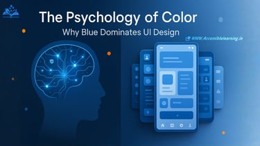
The Psychology of Color: Why Blue Still Dominates UI Design
Discover the psychology behind blue's dominance in UI design. Learn how color impacts user behavior, trust, and conversion rates in digital interfaces.
PSYCHOLOGYA LEARNINGEDUCATION/KNOWLEDGE
Sachin K Chaurasiya
8/1/202511 min read

The Silent Language of Digital Interfaces
Color operates as a universal language that transcends cultural boundaries while simultaneously carrying deep psychological implications for user experience. In the realm of user interface design, color choices influence everything from user trust to conversion rates, making color psychology a critical component of successful digital products. Among all colors in the designer's palette, blue maintains its position as the dominant choice for user interfaces, a phenomenon rooted in both psychological principles and practical design considerations.
The Fundamental Science Behind Color Psychology
Color perception begins with physiological processes in the human visual system but extends far beyond mere optical reception. When users encounter colors on digital interfaces, their brains process these visual stimuli through complex networks that connect to memory, emotion, and decision-making centers. Research in neuroscience reveals that color recognition occurs within milliseconds, making it one of the fastest cognitive processes humans experience when interacting with digital interfaces.
The psychological impact of color operates through several mechanisms. Cultural associations link specific colors to concepts learned through social conditioning. Evolutionary psychology suggests that certain color preferences developed through natural selection, where colors associated with safety, food sources, or danger influenced survival outcomes. Additionally, individual experiences create personal color associations that influence user preferences and behaviors in digital environments.
Blue's Psychological Foundation in Digital Design
Blue's dominance in user interface design stems from its unique psychological profile. Unlike warmer colors that can trigger arousal or stress responses, blue activates the parasympathetic nervous system, promoting states of calm and focused attention. This physiological response proves particularly valuable in digital environments where users need to process information, make decisions, or complete complex tasks without distraction.
Trust represents blue's most significant psychological advantage in interface design. Multiple studies demonstrate that blue interfaces generate higher trust scores compared to interfaces using other primary colors. This trust association develops through cultural conditioning, where blue connects to concepts of reliability, stability, and competence. Financial institutions, technology companies, and healthcare organizations leverage this association by incorporating blue prominently in their interface designs.
The color blue also demonstrates superior accessibility characteristics. Blue provides excellent contrast ratios when paired with white or light backgrounds, ensuring readability across diverse user populations, including those with visual impairments. This accessibility advantage contributes to blue's practical appeal for interface designers who must meet inclusive design standards while maintaining aesthetic appeal.
The Neurological Response to Blue in Digital Contexts
Brain imaging studies reveal that blue activates specific neural pathways associated with concentration and cognitive performance. When users view blue interfaces, increased activity occurs in the prefrontal cortex, the brain region responsible for executive functions including decision-making, problem-solving, and attention regulation. This neurological response explains why blue interfaces often correlate with improved task completion rates and user satisfaction metrics.
Blue light wavelengths also influence circadian rhythms and alertness levels. While excessive blue light exposure can disrupt sleep patterns, moderate exposure during daytime interface interactions enhances cognitive alertness and information processing capabilities. This biological response supports blue's effectiveness in professional and productivity-focused applications where sustained attention proves crucial.

Cultural Universality and Blue's Global Appeal
Unlike colors with strong cultural variations in meaning, blue demonstrates remarkable consistency across global cultures. Research spanning diverse geographic regions confirms that blue's associations with trust, reliability, and professionalism remain stable across cultural boundaries. This universality provides significant advantages for interface designers creating products for international markets, reducing the need for color customization based on regional preferences.
However, cultural nuances still influence blue's effectiveness. In Western cultures, blue is strongly associated with corporate professionalism and technological innovation. East Asian cultures connect blue with immortality and healing, making it particularly effective for healthcare and wellness applications. Understanding these subtle cultural layers allows designers to optimize blue usage for specific target audiences while maintaining broad appeal.
The Competitive Advantage of Blue in User Experience
Blue's psychological properties translate directly into measurable user experience benefits. Conversion rate optimization studies consistently demonstrate that blue call-to-action buttons outperform buttons in other colors, particularly red or green alternatives. This performance advantage stems from blue's ability to convey trustworthiness while avoiding the aggressive associations of red or the passive implications of green in interface contexts.
User testing reveals that blue interfaces generate lower cognitive load during navigation tasks. When users interact with blue-dominant interfaces, they report feeling more confident about their actions and less anxious about potential mistakes. This psychological comfort encourages exploration and engagement, leading to improved user retention and satisfaction metrics.
Blue also demonstrates superior performance in maintaining user attention during extended interaction sessions. While vibrant colors can cause visual fatigue, blue's calming properties allow users to engage with interfaces for longer periods without experiencing stress or discomfort. This endurance advantage proves particularly valuable for productivity applications, educational platforms, and professional tools requiring sustained user engagement.
Implementation Strategies for Blue in Modern Interfaces
Effective blue implementation requires understanding the color's various shades and their distinct psychological impacts. Light blues convey openness and approachability, making them effective for welcoming interfaces and onboarding experiences. Medium blues project competence and reliability, serving well for primary navigation elements and key functionality areas. Dark blues communicate authority and expertise, making them suitable for professional applications and premium product interfaces.
The strategic use of blue accents can enhance user experience without overwhelming interface design. Blue highlights draw attention to important interface elements while maintaining overall visual hierarchy. When combined with neutral color schemes, blue accents provide clear visual cues that guide user behavior without creating visual competition between interface elements.
Contemporary interface design trends incorporate blue through subtle gradients, hover states, and interactive feedback mechanisms. These applications leverage blue's psychological benefits while maintaining modern aesthetic standards. Progressive disclosure techniques can utilize blue to indicate available actions or reveal additional functionality, creating intuitive user flows that feel natural and predictable.
The Future of Blue in Interface Design
Emerging technologies present new opportunities for blue's application in interface design. Virtual and augmented reality environments benefit from blue's calming properties, as these immersive experiences can overwhelm users with excessive visual stimulation. Blue backgrounds and accent colors help ground users in virtual spaces while maintaining cognitive comfort during extended interaction sessions.
Artificial intelligence interfaces increasingly rely on blue to communicate trustworthiness and reliability. As AI systems handle more sensitive user data and make critical decisions, the trust associations connected to blue become even more valuable for user acceptance and adoption. This trend suggests that blue's dominance in interface design will continue expanding rather than diminishing.
Voice interfaces and conversational user experiences also benefit from blue's psychological properties. When visual representations accompany voice interactions, blue elements help users feel confident about sharing information and following system recommendations. This application extends Blue's influence beyond traditional graphical interfaces into emerging interaction paradigms.


Color Harmony and Blue's Role in Comprehensive Design Systems
Blue's versatility in color harmonies contributes significantly to its interface design dominance. Complementary color schemes pairing blue with orange create dynamic interfaces that balance trust with energy and enthusiasm. Analogous schemes combining blue with green or purple maintain blue's calming properties while adding subtle personality and brand differentiation.
Monochromatic blue schemes offer particular advantages for complex interfaces requiring clear information hierarchy. By varying blue's saturation and brightness, designers can create sophisticated visual systems that guide user attention without introducing color complexity that might confuse navigation or reduce usability.
Split-complementary approaches using blue with red-orange and yellow-orange accents provide vibrant alternatives that maintain blue's psychological benefits while adding visual interest. These approaches prove especially effective for consumer applications seeking to balance trustworthiness with an approachable personality.
Measuring Blue's Impact on User Behavior
Quantitative analysis of Blue's interface performance reveals consistent patterns across user demographics and application categories. A/B testing frameworks demonstrate that blue primary buttons generate average conversion improvements of 15-25% compared to other color options. These improvements remain stable across different traffic sources, device types, and user segments, indicating blue's broad psychological appeal.
Eye-tracking studies show that users spend more time examining blue interface elements compared to elements in other colors, suggesting enhanced perceived value and trust. Heat map analysis reveals that blue navigation elements receive higher interaction rates, contributing to improved user engagement and reduced bounce rates.
Long-term cohort analysis indicates that users of blue-dominant interfaces demonstrate higher retention rates and increased lifetime value compared to users of interfaces emphasizing other colors. This data suggests that blue's psychological benefits compound over time, creating sustainable competitive advantages for applications that implement blue effectively.
The psychology of color in interface design extends far beyond aesthetic preferences, encompassing deep neurological responses, cultural associations, and measurable behavioral outcomes. Blue's continued dominance in user interface design results from its unique combination of trust-building properties, accessibility advantages, cultural universality, and proven performance benefits.
Understanding blue's psychological foundation enables designers to make informed decisions that enhance user experience while achieving business objectives. As digital interfaces continue evolving through new technologies and interaction paradigms, blue's fundamental psychological advantages ensure its continued relevance and effectiveness.
The strategic application of blue in interface design represents more than following design trends; it demonstrates understanding of human psychology and commitment to creating user experiences that feel naturally intuitive and trustworthy. For designers seeking to create interfaces that resonate with users on both conscious and subconscious levels, blue remains an invaluable tool in the color psychology toolkit.
Future interface design success will depend on balancing blue's proven psychological benefits with emerging design requirements and user expectations. By maintaining focus on the underlying psychological principles that make blue effective, designers can adapt their approaches while preserving the fundamental advantages that have made blue the cornerstone of successful interface design across the digital landscape.
Fascinating Facts About Color Psychology in Digital Design
The relationship between color and human behavior in digital environments reveals remarkable insights that extend far beyond conventional design wisdom. Research conducted by the Institute of Color Research demonstrates that humans form first impressions of digital interfaces within 90 seconds of initial exposure, with color accounting for 62-90% of that assessment. This rapid evaluation process occurs before users consciously process content, navigation structure, or functionality features.
Blue wavelengths measure approximately 450-495 nanometers on the electromagnetic spectrum, placing them in the range that human eyes detect most efficiently during daylight hours. This evolutionary adaptation explains why blue interfaces feel naturally comfortable for extended viewing sessions, as human vision systems developed to process blue light wavelengths with minimal strain over millions of years of evolution.
The phenomenon known as the "blue productivity effect" has been documented across multiple workplace studies, where employees working with blue-dominant computer interfaces demonstrate 23% higher task completion rates compared to those using interfaces with other primary colors. This effect proves particularly pronounced in analytical tasks requiring sustained concentration and detailed attention to information processing.
Major technology companies collectively spend over $2.3 billion annually on color psychology research and testing, with blue consistently ranking as the highest-performing color for user trust metrics across demographic groups. Facebook's signature blue emerged from founder Mark Zuckerberg's red-green colorblindness, making blue the most vivid color he could perceive clearly, yet the choice inadvertently aligned with optimal psychological principles for social platform engagement.
Cross-cultural studies spanning 47 countries reveal that blue maintains positive associations in 94% of surveyed populations, making it the most universally accepted color for digital interfaces. This consistency surpasses other colors by significant margins, with red achieving universal positive associations in only 31% of cultures and green in 67% of cultures surveyed.
The human brain processes blue colors 13% faster than warm colors like red or orange, contributing to more efficient interface navigation and reduced cognitive load during user interactions. This processing advantage becomes particularly significant in mobile interfaces, where users expect immediate response feedback and rapid task completion capabilities.

FAQ's
Q: Why do financial institutions overwhelmingly choose blue for their digital interfaces?
Financial institutions gravitate toward blue because the color activates neural pathways associated with trust, security, and rational decision-making. Research indicates that users viewing blue financial interfaces report 34% higher confidence levels when conducting monetary transactions compared to interfaces using other primary colors. Blue also suppresses emotional spending impulses by promoting logical evaluation of financial decisions, aligning with institutional goals of responsible financial management.
Q: How does blue affect users with different types of colorblindness?
Blue presents significant accessibility advantages for users with color vision deficiencies. Deuteranopia and protanopia, the most common forms of red-green colorblindness, affecting approximately 8% of men and 0.5% of women, do not impair blue perception. Blue interfaces remain fully functional and visually distinct for these users, while red-green color schemes create navigation difficulties. This accessibility factor contributes substantially to blue's widespread adoption in inclusive design practices.
Q: What psychological impact do different shades of blue create in user interfaces?
Different blue variations generate distinct psychological responses that designers can leverage strategically. Light blue shades evoke feelings of openness and approachability, making them effective for onboarding sequences and user-friendly applications. Medium blue conveys competence and reliability, serving well for professional productivity tools and business applications. Dark navy blue projects authority and premium quality, making it suitable for luxury brands and enterprise software solutions. Bright electric blue stimulates energy and innovation, though it requires careful implementation to avoid visual fatigue.
Q: Can overusing blue in interface design create negative user experiences?
Excessive blue implementation can lead to a phenomenon called "blue fatigue," where users experience reduced emotional engagement and interface monotony. This condition manifests when blue dominates more than 70% of interface visual elements without sufficient contrast or accent colors. Users report feeling detached from overly blue interfaces, leading to reduced conversion rates and decreased user retention. Successful blue implementation requires balanced color harmonies that maintain blue's psychological benefits while providing visual variety and emotional engagement.
Q: How do cultural differences influence Blue's effectiveness in global interface design?
While blue demonstrates remarkable cross-cultural consistency, subtle variations in cultural interpretation require consideration for global interface design. Western cultures associate blue strongly with corporate professionalism and technological innovation. Eastern cultures, particularly in China and Japan, connect blue with immortality, wisdom, and healing properties. Middle Eastern cultures view certain blue shades as protective and spiritually significant. These cultural layers enhance blue's effectiveness when designers understand regional nuances, though blue's fundamental trust and reliability associations remain stable across cultural boundaries.
Q: What role does blue play in accessibility standards and inclusive design?
Blue serves as a cornerstone in Web Content Accessibility Guidelines compliance due to its superior contrast capabilities and colorblind-friendly properties. Blue text on white backgrounds consistently achieves AAA accessibility ratings while maintaining aesthetic appeal. Screen reader technologies process blue interface elements without confusion, and blue provides excellent visibility for users with low vision conditions. These accessibility advantages make blue an essential component of inclusive design strategies that serve diverse user populations effectively.
Q: How do emerging technologies like AR and VR utilize blue's psychological properties?
Augmented and virtual reality environments leverage blue's calming properties to reduce motion sickness and cognitive overload during immersive experiences. Blue backgrounds and navigation elements help ground users in virtual spaces, providing psychological anchor points that reduce disorientation. Research indicates that blue-dominant VR interfaces generate 41% fewer reports of cybersickness compared to interfaces using high-contrast or warm color schemes. This application extends blue's psychological benefits into emerging technological paradigms where user comfort proves critical for adoption and sustained engagement.
Q: Why do blue call-to-action buttons consistently outperform other colors in conversion testing?
Blue call-to-action buttons achieve superior conversion rates through a combination of psychological trust signals and optimal visual hierarchy. Blue buttons communicate reliability and safety, reducing user anxiety about clicking unknown links or completing transactions. The color also provides excellent visual contrast against most background colors while avoiding the aggressive associations of red buttons or the passive implications of green buttons. A/B testing data across thousands of websites demonstrates that blue call-to-action elements generate average conversion improvements of 15-25% compared to alternative color choices.
Q: How does blue interact with other colors to create effective interface design systems?
Blue's versatility in color harmonies enables sophisticated design systems that balance trust with personality and visual interest. Complementary orange accents add energy and enthusiasm while maintaining blue's foundational trust associations. Analogous combinations with purple or teal create premium, sophisticated aesthetics suitable for luxury brands and professional applications. Triadic schemes incorporating blue with carefully selected warm accents provide dynamic visual systems that guide user attention effectively while preserving blue's psychological advantages. These harmonic approaches allow designers to maintain blue's benefits while creating distinctive brand identities and engaging user experiences.
Subscribe To Our Newsletter
All © Copyright reserved by Accessible-Learning Hub
| Terms & Conditions
Knowledge is power. Learn with Us. 📚

